feelgrounds.com redesign:
User-centered information architecture for a scalable e-commerce experience
A systematic restructuring of the Feelgrounds homepage that caters to different user types along their individual customer journey and leads to better conversion rates thanks to clear information architecture.
The challenge:
Product-focused instead of user-centered
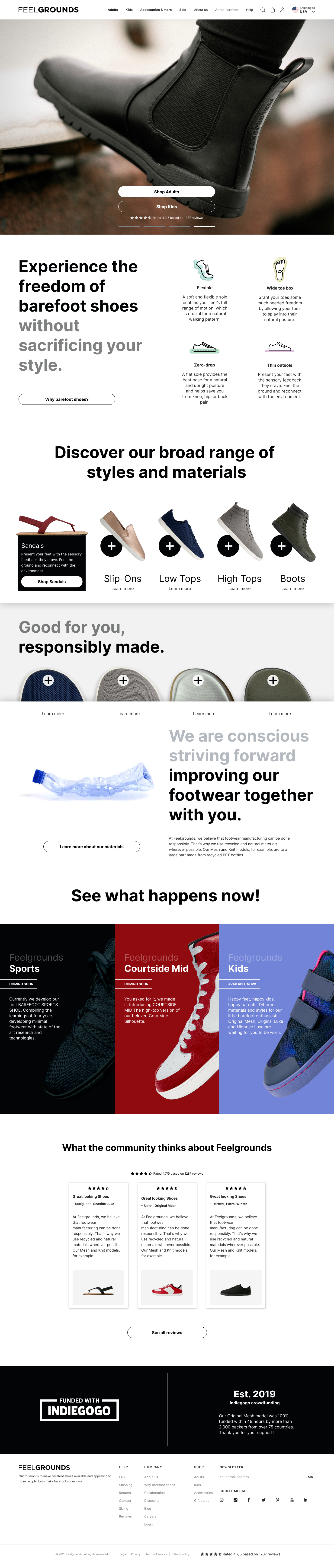
The existing Feelgrounds homepage was primarily designed as a product gallery. A series of models without clear differentiation. Visitors landed on a generic overview; user flows and customer statuses were not taken into account.
The result: High bounce rates for organic and direct visits. Users who came via Google or directly to the homepage found no orientation. There was a lack of clear user guidance that took into account different entry motives. In addition, there was no uniform design system. UI components varied across touchpoints, which weakened brand perception.
Old homepage design
Research & insights:
User understanding as a foundation
Systematic data analysis to identify user types and behavior patterns.
The first step was to develop a thorough understanding of Feelgrounds users. Instead of relying on assumptions, I analyzed quantitative and qualitative data sources:
Three distinct user types emerged from these data sources, which differ significantly in terms of motivation, level of knowledge, and entry point:
Personas & user Journeys: Different paths, one goal
Based on the research insights, I developed three detailed personas, each of which requires a different entry path on the homepage. The idea: just as a physical store offers different areas for different customers, the digital homepage should also allow for different entry paths.
Understand what barefoot shoes are and whether they are right for her
Path:
Hero Section → Value Proposition → Product Categories → Brand Story
Compare models, understand materials, buy quickly
Path:
Style finder / Category → Comparison → Product page
Discover new models, see the community, experience brand values
Path:
New products → Upcoming developments → Product selection or LEAD Sign Up
Funnel-analysis & strategic architecture
Structuring according to traffic sources and awareness levels
To optimize the information architecture of the homepage, I analyzed the different entry points and their typical user journeys:
This analysis resulted in a new homepage architecture based on the awareness levels of users – from “Unaware” to “Most Aware”:
UX-Concept & wireframes:
From strategy to structure
Based on the strategic architecture, I developed wireframes that visualize the new information hierarchy. The focus was on user orientation and clarity of information.user orientation and clarity of information.
Core principles of the UX concept:
UI Design & Design System:
Scalable Consistency
From corporate identity to modular UI kit
The UX structure formed the basis for the visual design. The goal was to develop aUI system that both aligns with the corporate identity and is scalable and reusable.
Design System Components:
The entire UI system was documented in Figma asthe Feelgrounds UI Kit, enabling the team to independently create new touchpoints and marketing materials without losing visual consistency.
Wireframes for the new architecture
Results & learnings: User understanding as a success factor
The restructuring of the Feelgrounds homepage led to measurable improvements in user guidance and conversion performance:
Beyond quantitative metrics, the project created a scalable foundation for future campaigns and touchpoints. The UI system enables the marketing team to independently produce consistent content.
Final Homepage Design – Live Preview
 -->
-->
